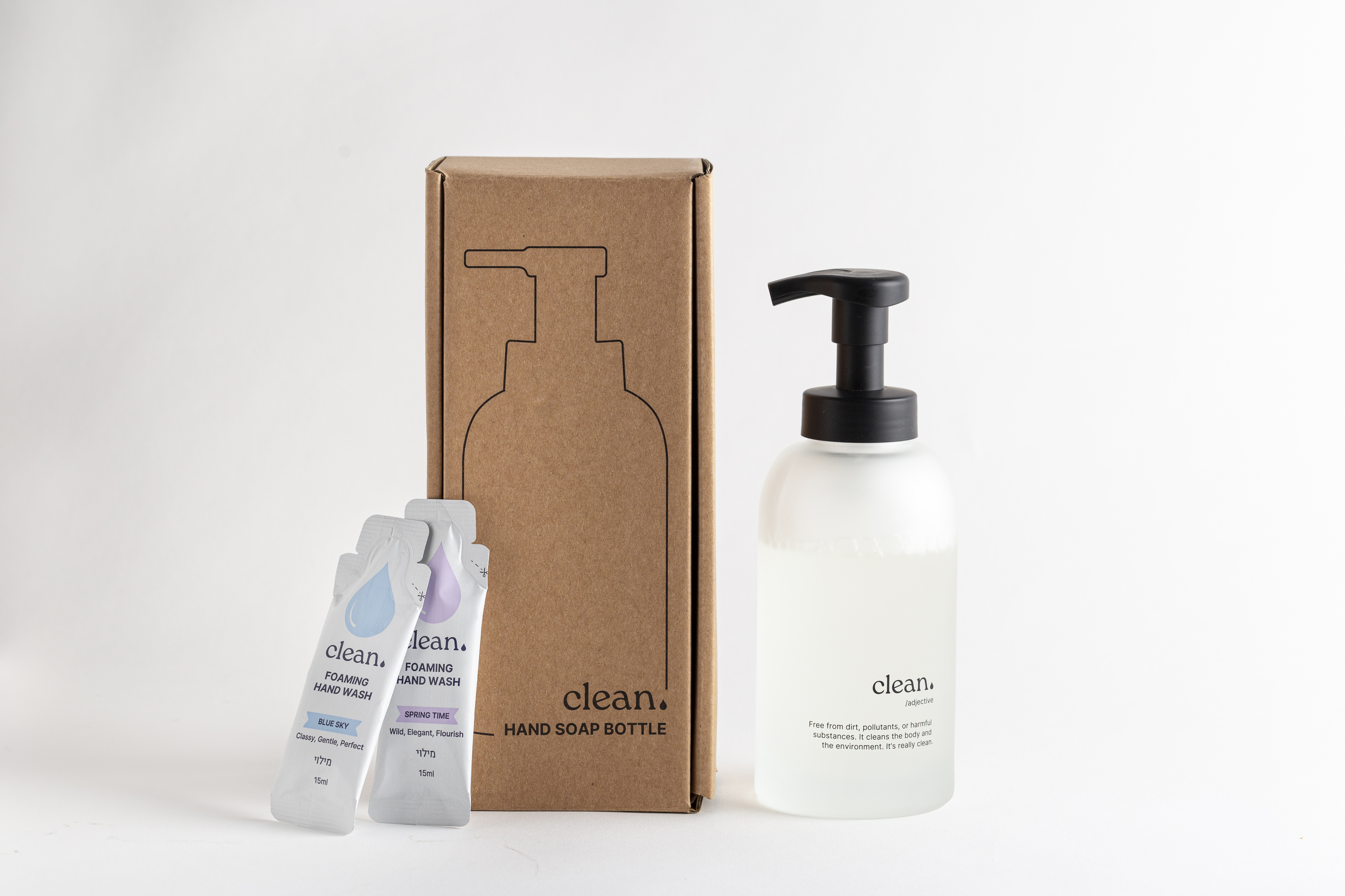
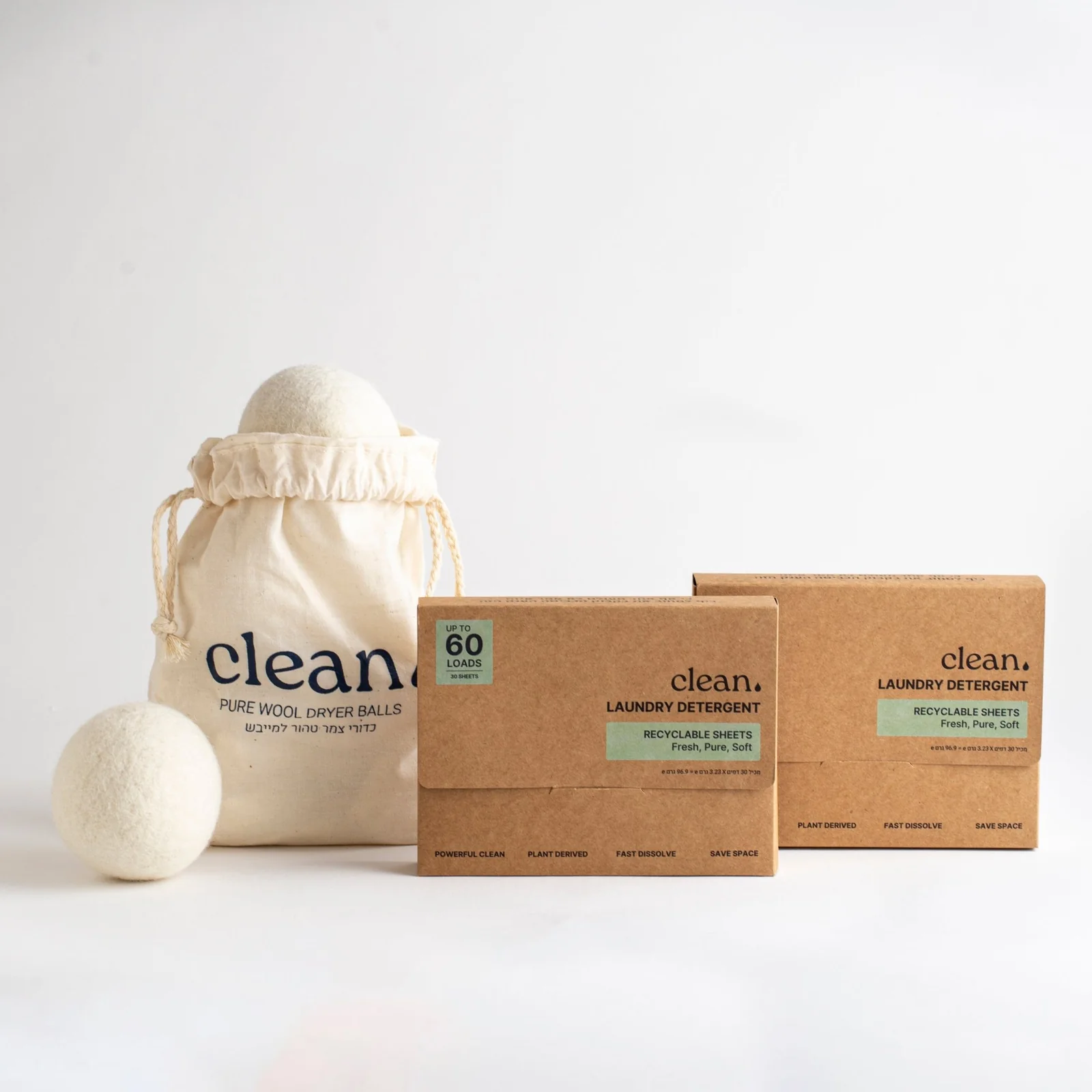
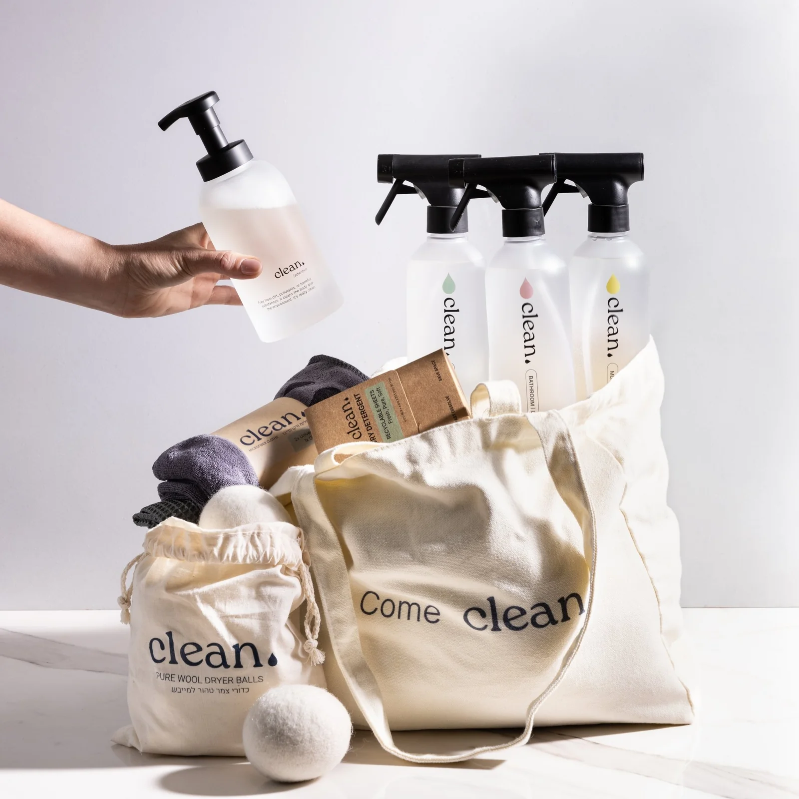
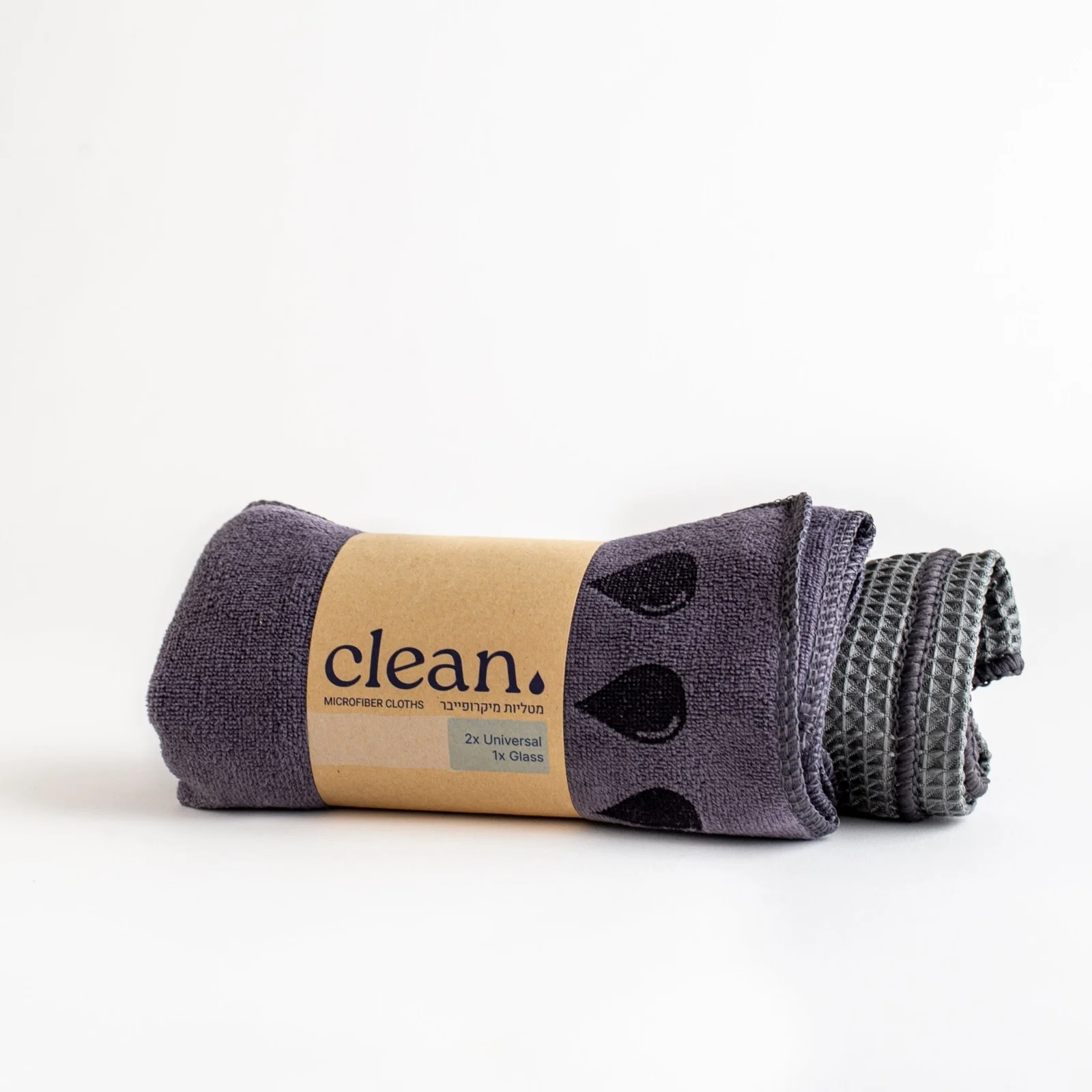
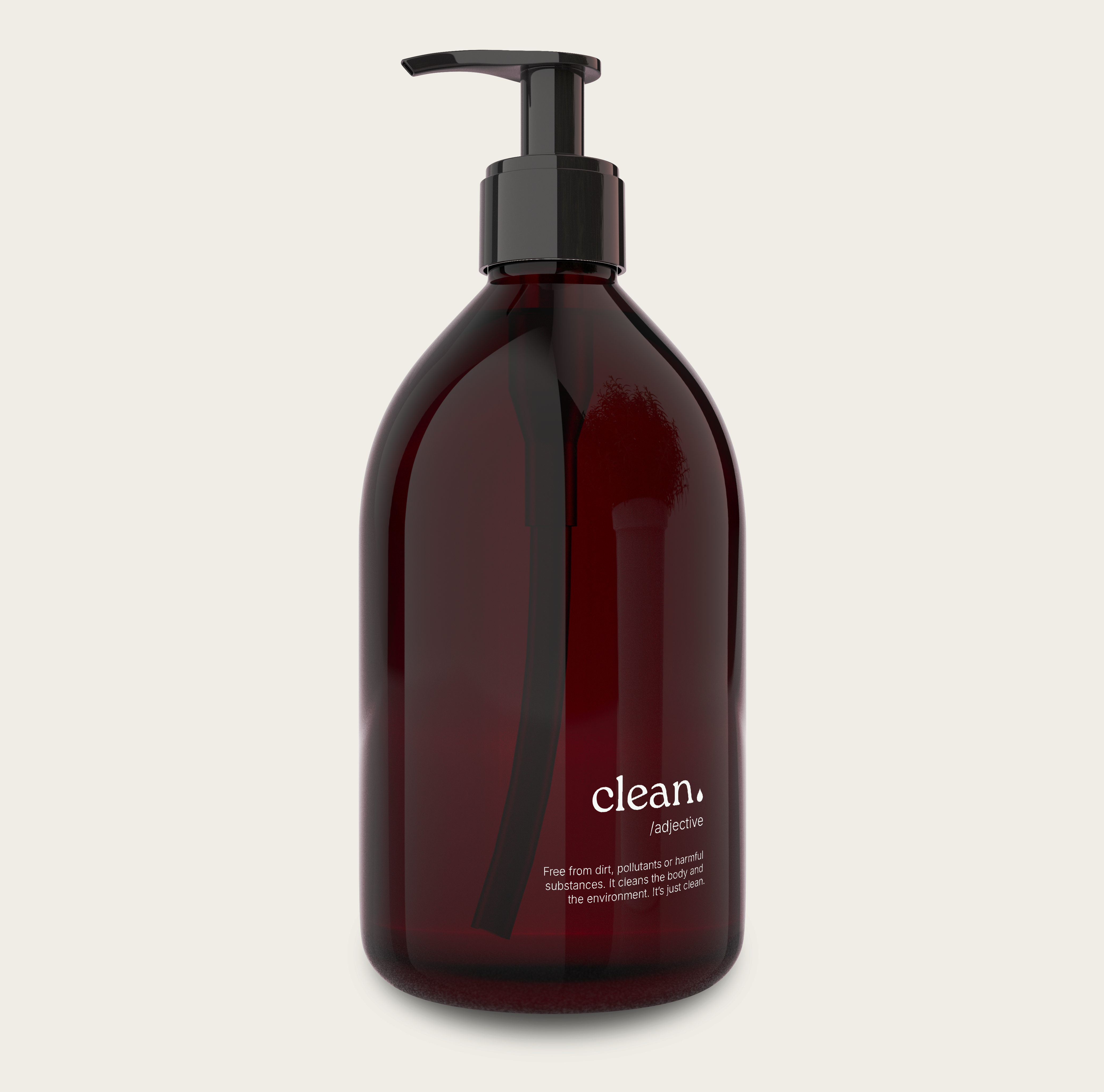
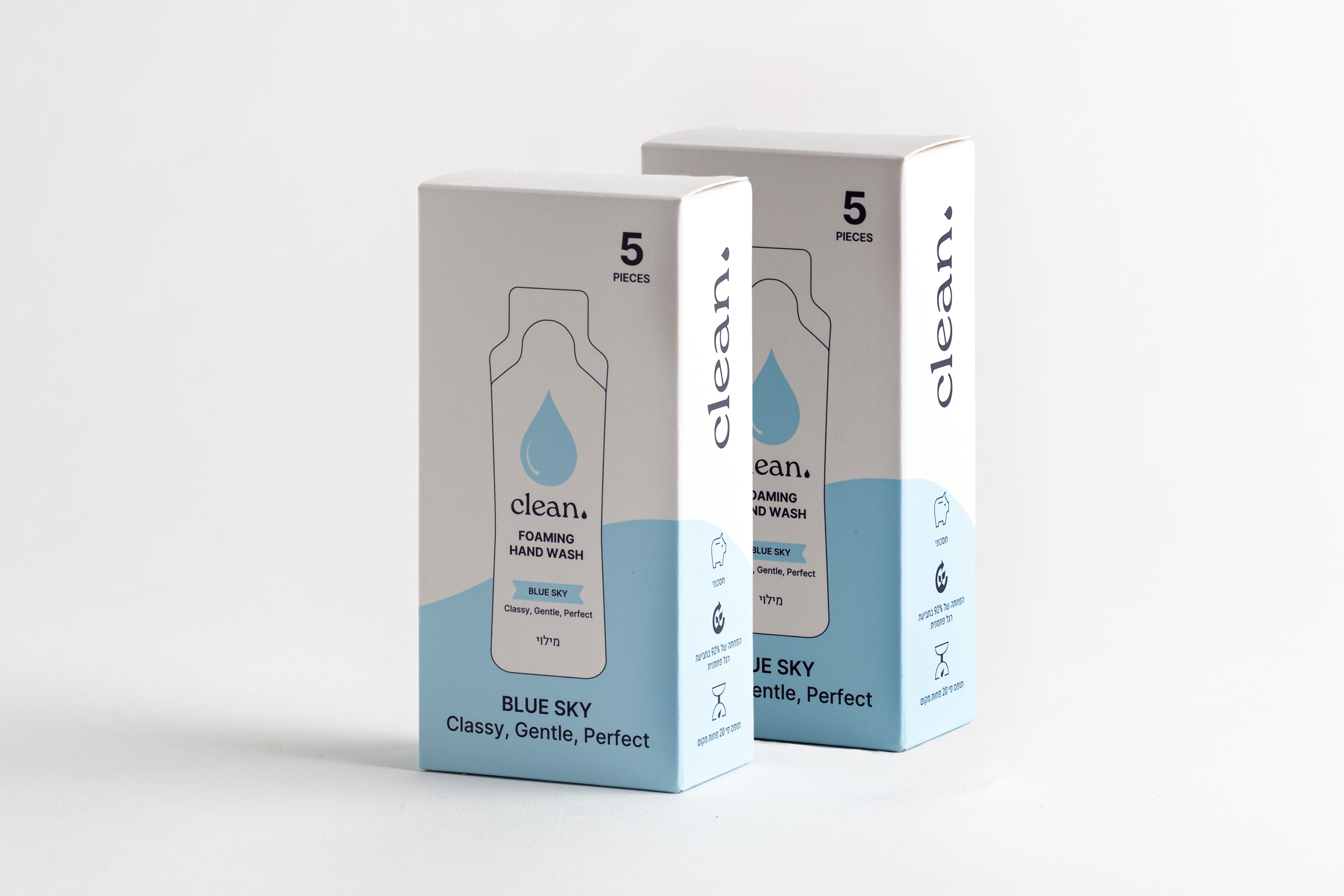
Keeping It Clean

The packaging had to make sustainable cleaning products feel premium enough to stay visible in the home.

DELIVEREDBRANDING2024

Keeping It Clean hero

The Challenge

Cleaning products are usually designed to disappear under the sink. For The Clean Dot, the challenge was the opposite: create packaging that feels premium enough to stay visible, while still communicating sustainability in a direct and credible way. The visual system needed to look clean without becoming sterile, and distinctive without feeling loud.

The Approach

I approached the range as one coherent product family rather than isolated labels. The structure relies on typographic hierarchy, controlled spacing, and a disciplined grid so users can scan product differences quickly without losing brand consistency. Instead of decorative cues, I used proportion, rhythm, and material-sensitive layouts to carry the premium feeling.

The Decision

The key decision was to keep the visual language restrained and let clarity do the work. By reducing decorative noise and emphasizing precise structure, the packaging earns visual trust and supports everyday usability. That choice helps the products live on the counter as part of the home environment, not hidden as compromise items.

Keeping It Clean - Image 2
Keeping It Clean - Image 3
Keeping It Clean - Image 4
Keeping It Clean - Image 5
Keeping It Clean - Image 6
Keeping It Clean - Image 7

Next Project

Digital Handprint

Turning cursor movement into a daily digital self-portrait.

View project